By SI SPENCER, AUGUST 2017
Prior to 1931 travellers on the Underground were in a mess of guesswork and paperwork. Every line was owned and run by different operators and each produced their own maps covering only their own service. This meant travelling around London involved having a separate map for each line and cross-referencing them to find your connections.
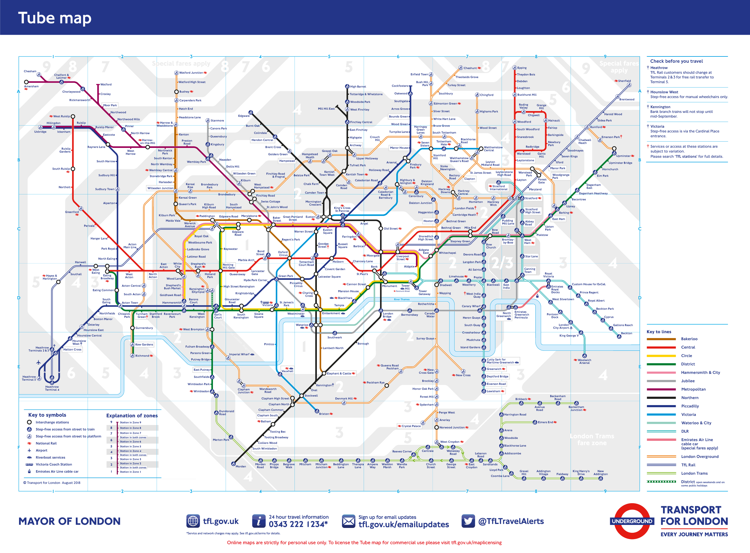
To make it more confusing, they were drawn to scale and from the perspective of someone above ground and included drawings and representations of various landmarks. All very pretty and mildly useful but taking up a lot of space. Then in 1931 a London Underground engineering draughtsman called Harry Beck created one of the greatest pieces of design in modern history. His background in reading and designing technical schematics for electrical and signalling systems inspired him with the knowledge that nobody cared exactly where things were, what was there or how far apart they were – they just wanted to know how to get from one station to another and where to change. And thus the first version of the map was born but as Harry had never been asked to design it and he’d done some of the work on company time, he was never paid for it and his heirs receive no copyright royalties. Various drafts of Harry Beck’s maps can be seen at the London Transport Museum in Covent Garden. If you’re not a transport geek, it’s still worth a visit for the gift shop alone to pick up some design classic merchandise. A facsimile of the first map is on view at Finchley Central Tube station where Harry used to begin his morning commute to work. Bizarrely ‘Finchley Central’ also inspired a UK top twenty hit single for the New Vaudeville Band in 1967. Harry’s map has its idiosyncrasies. Use the map to get from Regents Park to Great Portland and you need to change lines and travel three stops but walk to the surface and you’ll find the two stations are a hundred metres apart. Leicester Square to Covent Garden is only one stop but the most expensive train journey on the planet by penny per mile. And don’t try and work out why you have to take the Northern line southbound to get from Kings Cross to Angel when it’s so clearly to the north. But those eccentricities are what make Harry Beck’s map so beautifully English, so complicatedly yet so beautifully London.